Vodafone
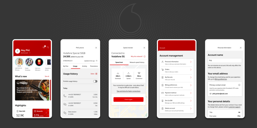
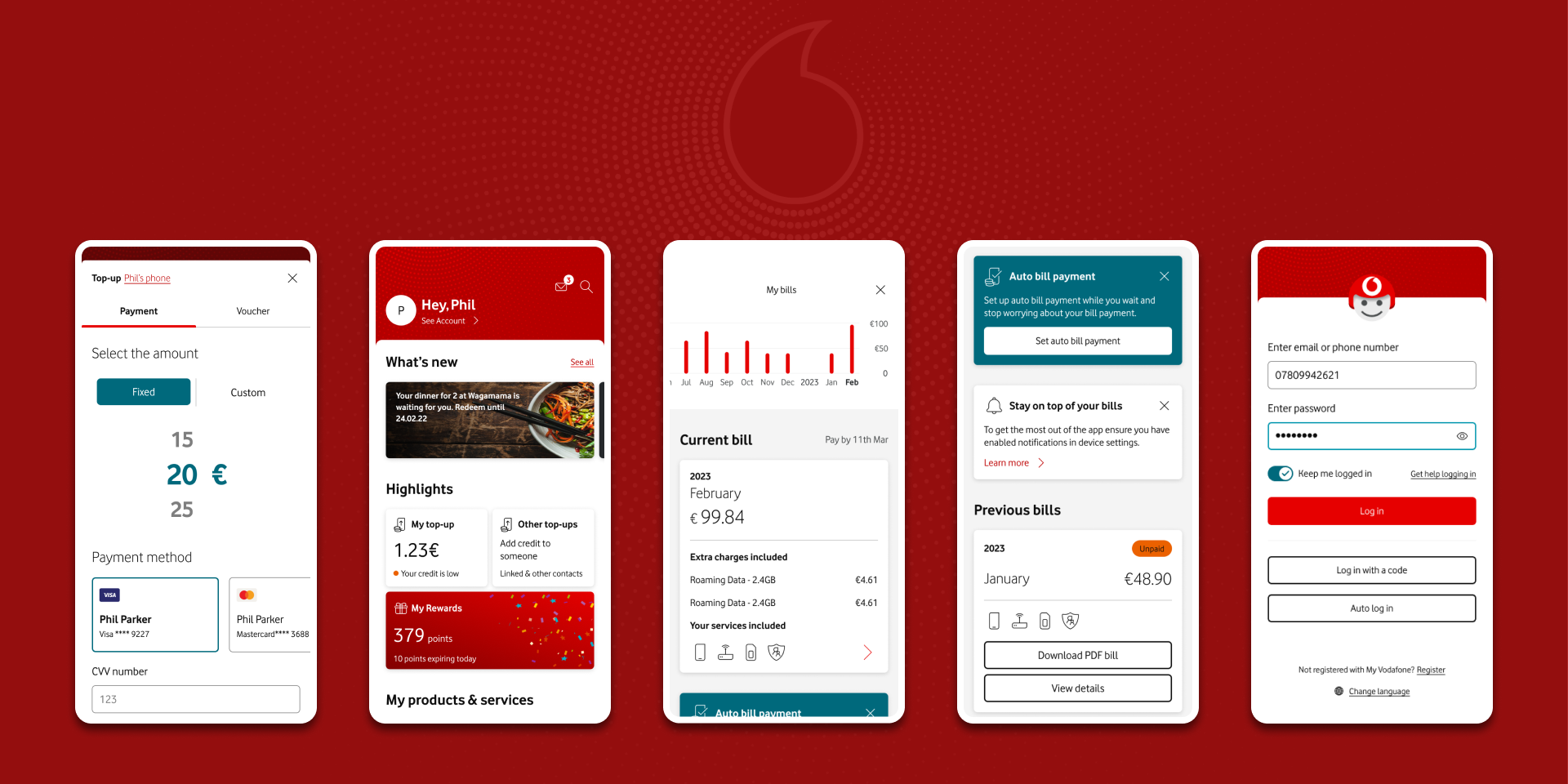
In December 2019, Vodafone hired me as a Senior UX Designer and Product Designer for its flagship digital product, My Vodafone Application.
During my time, I have led multiple in-house projects from inception to delivery, managed multiple squads and teams of cross-discipline teams, and provided a vision for projects.
Through careful process adjustments and the introduction of new technologies, we have increased the efficiency of the design team, made the processes lean and agile, reduced task fatigue, and raised the quality standards for deliverables across Vodafone’s global domain.
Service Design Day Budapest 2023 Guest presenter.
A Brigitta Serbán and I delivered a presentation on “Road to OneApp”: How we organized our projects and delivered OneApp to three markets simultaneously.
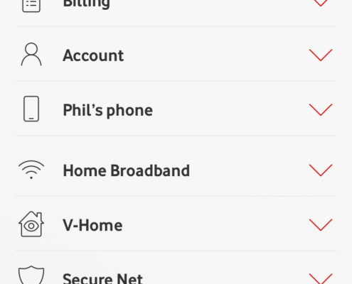
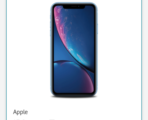
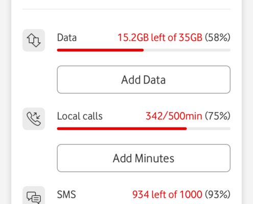
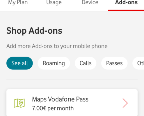
MyVodafoneApp MVA10 Group Reference Design
My Work
- Conducted rapid A-B testing and evaluated User Research results to identified points of improvements
- Improved existing Epics, Journeys, and screens based on feedback from users and developers.
- Created new designs for ever-changing requirements.
- Adjusted and revised existing components.
- Based on business requirements delivered concepts and designs for features to be developed.
- Constantly communicated with POs and Developers to align needs and deliverables.
Results
Delivered countless new screens and updated multiple epics and journeys tailored to specific requirements. Often adapting to the needs of global market design teams.
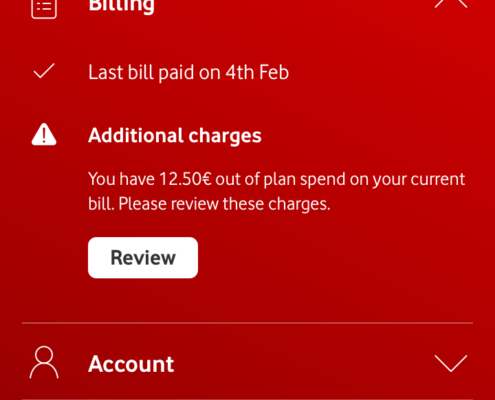
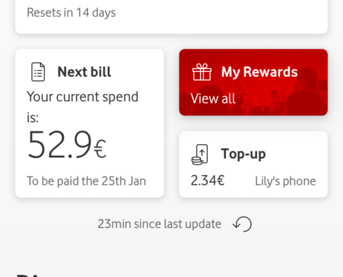
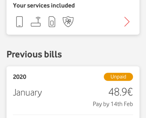
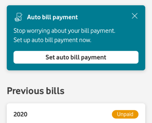
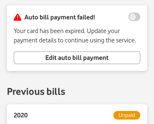
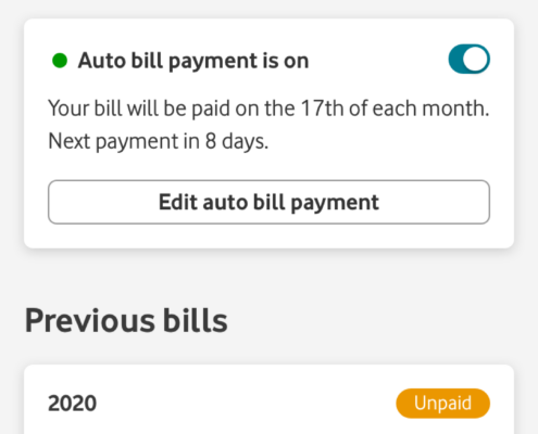
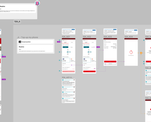
Designed business-critical flows, such as Top-up, Billing, Barring and unbarring, SIM and eSIM, Purchase, and the list goes on.
I actively participated in the Design System Governance calls to further develop our design system’s capabilities and gain more insight into the Source team’s day-to-day operations.
Improved documentation and delivery methodologies and significantly increased the Design team’s efficiency.
Insight gained
Designing for a global market with multiple countries and hundreds of teams with more projects than I could ever hope to count is a huge challenge not many companies face. As part of the Global Reference Design team at the Vodafone Design Studio, it was imperative that we release flexible and scalable designs that can be utilized in vastly different ways, occasionally breaking established rules.
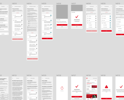
Migration from Sketch to Figma
Migration between design tools is not an easy task, and more so when it comes to a global corporation. Multiple months of planning preceeded the decision to move away from Sketch to Figma.
My Work
- Tested and adjusted procedures related to the migration process.
- Updated designs and translated them from Sketch to Figma
- Using a small team, converted older designs to the new system.
- Maintained meticulous quality checks on designs to ensure the best possible results.
- Revised existing journeys and epics to fit the real scenarios better and reduce screen and journey duplication.
Results
We have migrated all our designs to Figma, rebuilt them using the new Source design system, and updated our work procedures to allow version history and milestone delivery and retain agile day-to-day operations.
It was critically important to deliver new Figma files as the Design team needed them to maintain seamless operation.
Insight gained
To this day, I can’t believe I orchestrated this procedure. Converting designs with a small team while the larger part of the team kept designing to new requirements was a challenge on its own. The task grew more complex as the Design team required specific timings for certain files to ensure a seamless transfer.
Not every day do I see a large corporation like Vodafone transition between design tools, and very few people can say they have been the driving force behind the process.
I gained invaluable insight into Vodafone’s and the broader market designer’s day-to-day operations throughout the migration process. This task allowed me to further develop and refine our processes and update many of our outdated ways of working.
OneApp Designs
OneApp is the new generation of designs for Vodafone’s flagship product, the MyVodafone App. Instead of working on a Reference Design that is a nonexistent idealistic version of the application, we have decided to make a real product.
We unified the application’s codebase and began transferring designs from a virtually nonexistent product to a fully developed application with real requirements and answers to users’ needs.
OneApp takes Vodafone’s designs to a whole new level.
My Work
- Designed against real requirements.
- Delivered detailed wire-frames and high-quality pixel-perfect designs.
- Adjusted flows and journeys based on multiple new requirements and limitations.
- Maintained high-quality standards through reviews and check-ins with our team members.
- Created variations based on country requirements.
- Constantly improved journeys and epics with small incremental changes.
Results
OneApp was a huge, huge step forward in product and service design. It has been adopted by 6 countries so far, and more are on the way. Each journey and epic had been reviewed and re-designed based on new market requirements and needs.
With a more flexible approach to design delivery, we allowed markets to customize their version of OneApp further without needing to rewrite the entire code. The efficiency improvements for markets alone proved to be a strong justification for the program’s existence and strengthened our belief in its goals.
New Internal Processes
Through the efforts of OneApp, we have come to the conclusion that, at the time, current ways of working, definitions of done, and release processes were woefully outdated and didn’t serve their function any longer. In most cases, these processes were huge, time-consuming tasks that led the Design team to do more work than needed, reducing overall efficiency.
A change needed to happen…
My Work
Through my experience working with multiple design studios, freelancers, and outside projects of my own, I’ve seen the inefficiencies and the extra work we needed to do for each task just to maintain our old ways of doing things, and I formulated a plan.
I took it upon myself to change all of it.
- Through the lens of past experiences, I began to identify key pain points of our team.
- Deconstructed the old release processes, ways of working and definition of done to their smallest elements.
- Using example epics and journeys continuously expanded and revised our processes until a new system emerged.
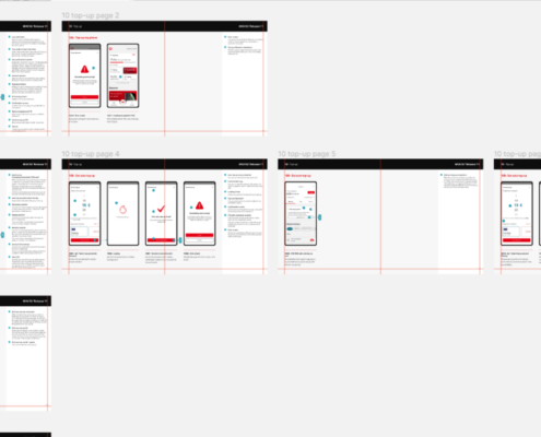
- Demonstrated the efficiency and speed of our new documentation methodology, release methodology and versioning system to the stakeholders and POs, slowly gaining traction within the team.
- I took the criticism and feedback and revised the proposal until it was deemed worthy of adoption by the greater Design team and many markets.
Results
The new ways of working and documentation project was an incredibly hard-earned victory.
I am lucky to say I was able to change an entire global corporation’s internal working processes. This is a dream for many design studios agencies and was a long-time brewing project for me.
The new documentation system reduced designer time estimations by an average of 40%.
Developers welcomed the new system as the in-flow style helped them visualize the complete journey of the user and provided a clear path for the development process.
The new system was touted as faster, easier to read, and better to understand than the old system, and with the added version control, developers didn’t need to keep a local copy of designs; they had a point of reference to work with and could align within the teams much easier.
The new system was named Bloom (Yes, I like to name projects. Why do you ask?) and instantly became an integral part of Vodafone’s work processes.
Accessibility improvement
In 2020, Vodafone pledged to improve the accessibility of its entire product range.
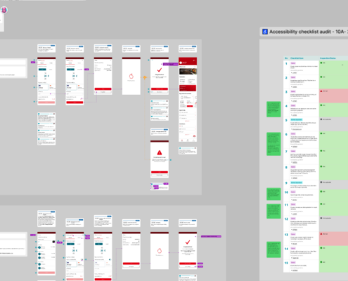
We worked with accessibility specialists and user Researchers to determine how to achieve this goal. We conducted detailed analyses of our current solutions, interviewed people with different accessibility challenges and needs across a wide spectrum, and devised a plan to improve journeys and individual screens.
My Work
Relying on my experience at Microsoft, we began creating an action plan for the basics. During the process, more and more of the planning and action details were aligned with Vodafone’s goals. We aimed our designs to reach WCAG 2.2 AA compliance.
Our work included:
- Audited current epics and flows to identify Accessibility issues.
- Prioritised issues based on severity and impact.
- Work together with designers and developers to figure out the solution to more complex issues.
- Delivered updated designs that meet WCAG 2.2 AA compliance.
- Refined and adjusted flows that required the users to interact in non-accessible ways, blocking them from reaching their goals.
Results
Our application and ecosystem went from not “meeting requirements” to WCAG 2.2 AA compliance and, in some cases, even better.
Migrate accessibility guidances and changes to Vodafone Source, Vodafone’s design system.
Insight gained
With more and more regulations incoming regarding accessibility, site and app developers need to pay more attention to the needs of their users. The earlier this process starts, the easier it is.
It was invaluable experience to learn to plan and adjust the design system to meet strict accessibility requirements for a huge company like Vodafone, which has a varied product portfolio.
